Try scrolling on the image to see the rest of the home page!
The Client
Homes in the City (HIC) is a collective of non-profits based in Bhuj, Gujarat. They do some amazing work in areas like climate change, women empowerment, and labour rights. However, they lacked a website that could demonstrate their 15+ year legacy of working with the people of Bhuj. Websites have become indispensable tools in today’s landscape for non-profits trying to generate visibility, trust, and community engagement. The client came to me with little more than a logo and some copy in their brochures and we set out to plan and build a website for the organisation.
The Process
Content Mapping
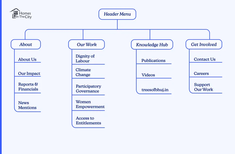
Projects like this are great because they allow me to wear so many different hats! With my extensive experience building websites for non-profits, I was able to work with my primary POC at HIC - Sourav Roy - to think through and figure out who the audience for their website was going to be, what information they needed, and how best to structure and present the information. By the end, we had a sprawling Miro Board which we condensed down into the following site map.

Wireframing
With a sitemap figured out, I moved onto creating wireframes of some of important pages on the site using Adobe XD. Wireframes help us focus on the layout and flow of information at this stage without having to deal with the more subjective aspects of design just yet. Wireframes also help me as the developer think about the various components I would need to build later on and plan ahead.

Try scrolling on the home page wireframe.
Design
Once we had the wireframes for a few pages, I iterated rapidly with the designs taking feedback from Sourav at HIC. This process yielded three distinct visual identities to choose from which I then presented to senior staff at the client organisation. Flip through the slides from the meeting below to see the designs. Which one would you have gone with?

This option was born out of an understanding of how important the city of Bhuj was to the organisation's identity. With this design, I wanted to situate the city in the larger Indian context so that it is immediately clear which city we are referring to in our name. However, the green hinted too heavily (and incorrectly) at us being an environmental group.
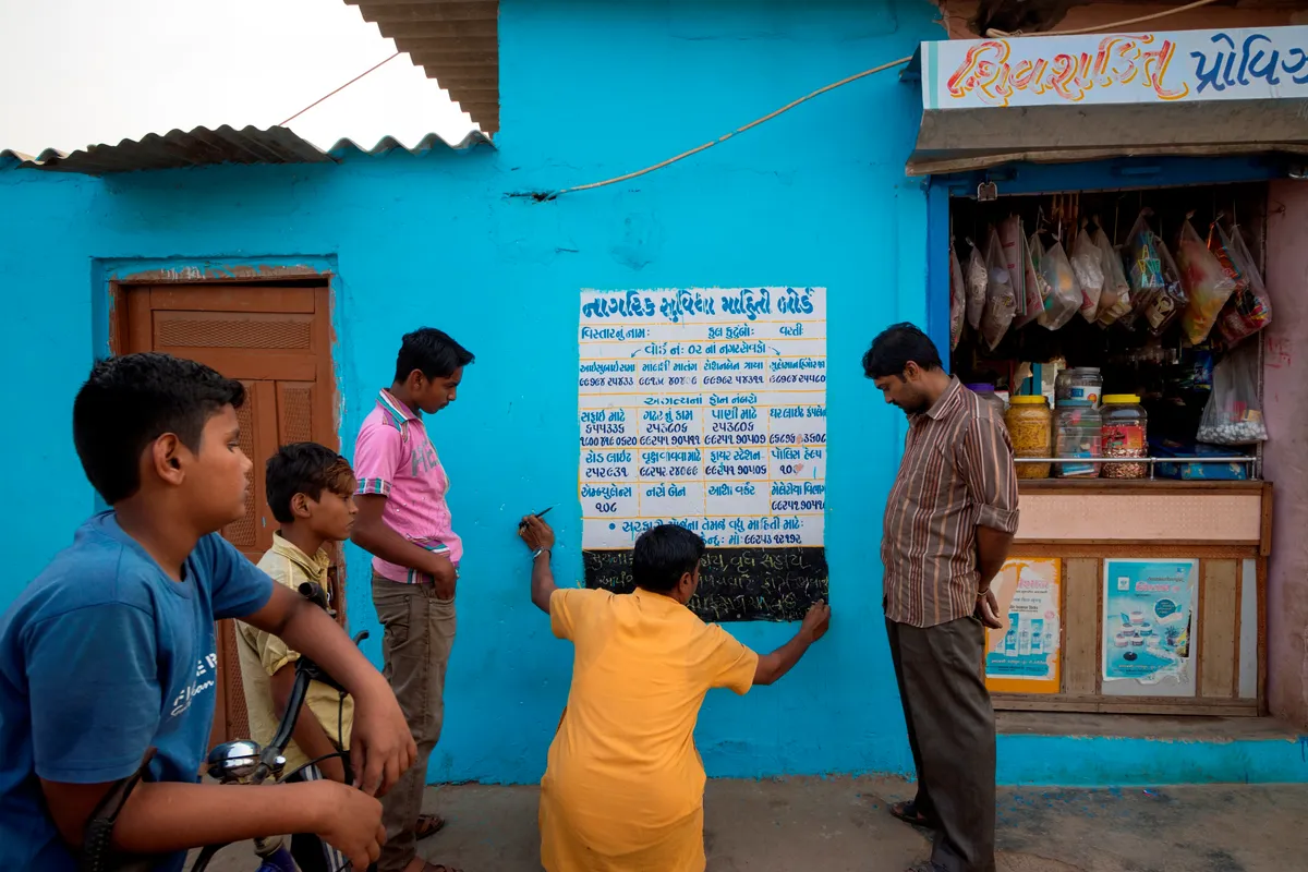
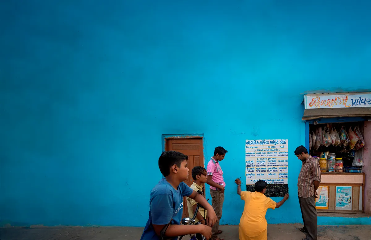
The design we settled on wouldn’t have been possible without this little bit of behind‑the‑scenes magic with Photoshop! When I came across this image in my client’s catalogue, I could help but wish the blue wall had been big enough for me to set some text onto it. Having a versatile skill set definitely came in handy here! I painstakingly extended the blue wall to the left and painted out the roof that cuts across the original image. Drag the slider below to compare the before and after!


Development
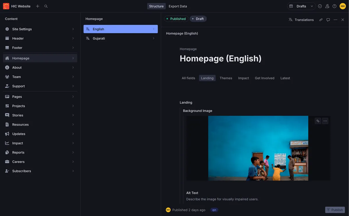
For the content management system, I chose to go with Sanity for their minimalist UI, great developer experience, and an excellent image optimisation pipeline. It was particularly well suited for this project due to its support for multilingual content.
It’s been years since I switched away from using WordPress and the feedback from my clients towards Sanity has been overwhelmingly positive. Sanity offers a generous free tier which we would never exceed but even if we did, they offer free upgrades to their paid plans for verified non‑profits. And unlike WordPress, you don’t need to worry about security vulnerabilities stemming from unmaintained and outdated software. Take a peek at the UI below!

For the frontend, the functionality offered by SvelteKit enabled me to implement features like language based routing, complex form handling, accessibility, animations, and much more while keeping the site performant. Even with all its images, the homepage loads with just under 1.1 MB of data transferred!
The Result
A fully accessible, bilingual, easily maintainable, and fast loading website and a really happy client! Scroll back up to see the finished project!